MUJI Looks Simple Until You Copy It
Minimalism is easy to imitate. Restraint is much harder to build.
No loud branding. No dramatic claims. No visual tricks competing for attention.
MUJI gives you plain type, quiet materials, restrained colors, and more empty space than most brands would ever be comfortable leaving alone.
And somehow, none of it feels unfinished.
It feels settled.
That is the part people underestimate.
It is not minimalism. It is discipline.
A lot of brands try to copy MUJI by removing things.
- Remove the color.
- Remove the graphics.
- Remove the expressive typography.
Then call the result minimal.
But removing things is easy. Knowing what can disappear without weakening the system is much harder.
MUJI does not feel calm because there is less design. It feels calm because the same decisions keep showing up again and again: in the typography, packaging, materials, store environments, product information, photography, and even the way objects are displayed.
The simplicity is not the idea. Consistency is.
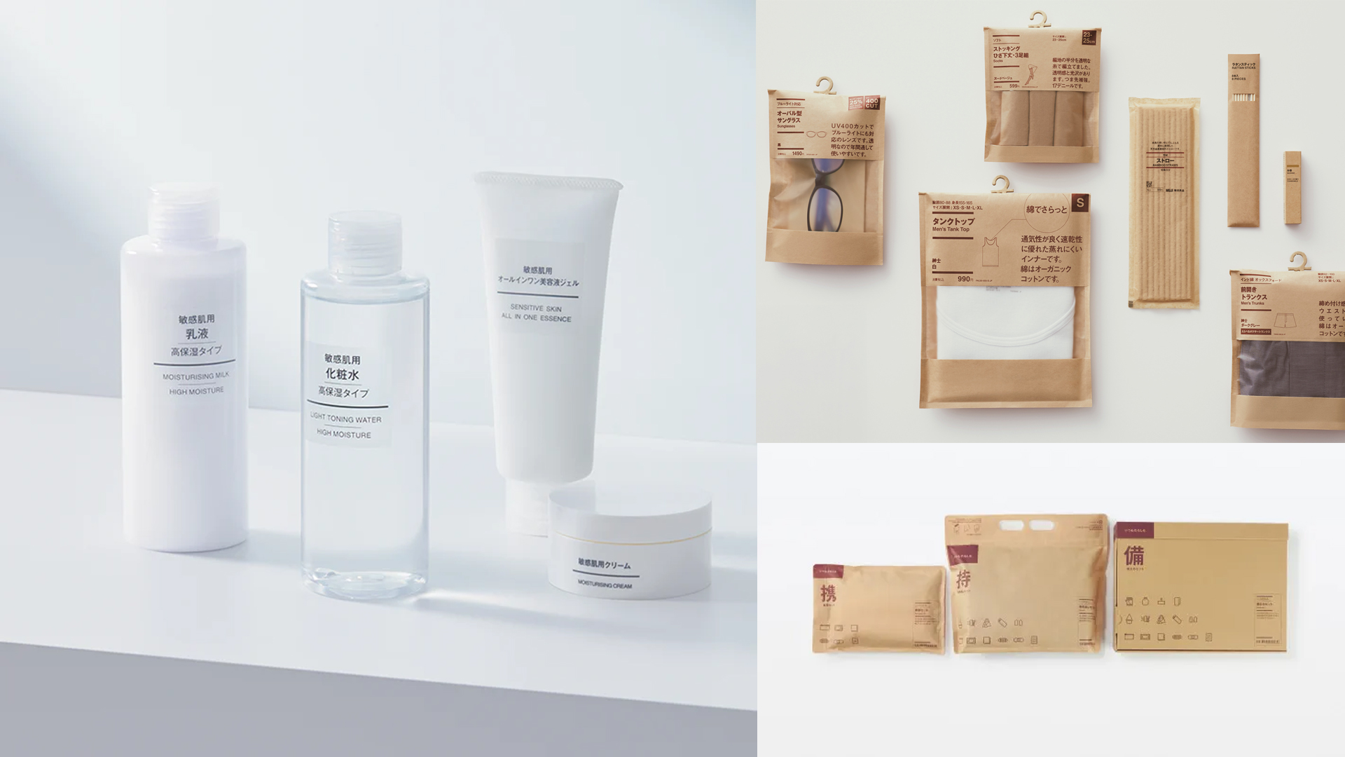
The interesting part is how little the system seems to panic.
A skincare bottle does not suddenly need to become luxurious.
A pack of kitchen supplies does not need a personality.
A storage box does not have to become an advertising surface.
Each product is allowed to remain what it is, while still clearly belonging to the same world.
The quiet function is trust
When a system behaves predictably, your brain stops renegotiating the relationship every time you encounter it.
You already know where to look.
You understand what is important.
The tone feels familiar before you have consciously processed any of it.
That reliability is doing more work than decoration ever could.
MUJI does not need every object to persuade you. The system has already done the convincing.
And that changes the interaction.
The packaging feels less like a pitch and more like information. The materials feel considered rather than embellished. The hierarchy is there to help you understand the object, not to make the graphic designer visible.
This is why MUJI’s restraint rarely feels empty. There is still plenty of design. Most of it simply knows when to stay quiet.

Why it is harder than it looks
Restraint creates a strange problem. The fewer things you use, the more responsibility each remaining decision has to carry.
- Spacing becomes voice.
- Alignment becomes tone.
- Type size becomes confidence.
- Material becomes positioning.
- Placement becomes hierarchy.
There is nowhere for weak decisions to hide.
A loud identity can sometimes distract you with enough expression. A restrained identity cannot.
If the spacing is wrong, you notice it.
If the material feels cheap, you feel it.
If the typography lacks discipline, the entire thing becomes generic.
That is why copying the appearance of MUJI usually fails.
You can imitate the beige paper. You can use Helvetica. You can remove the graphics.
But without the underlying discipline, you only reproduce the silence.
Not the system.
MUJI’s strength is not that everything looks the same.
It is that everything seems to follow the same attitude.
Nothing tries too hard.
Nothing suddenly becomes louder because it is scared of being ignored.
And because those rules survive across thousands of products, environments, and interactions, simplicity stops being a visual style and becomes something much more valuable: a way of behaving.
Minimal is not the style. Restraint is the system.