The Most Important Boring Typeface
Journal Description
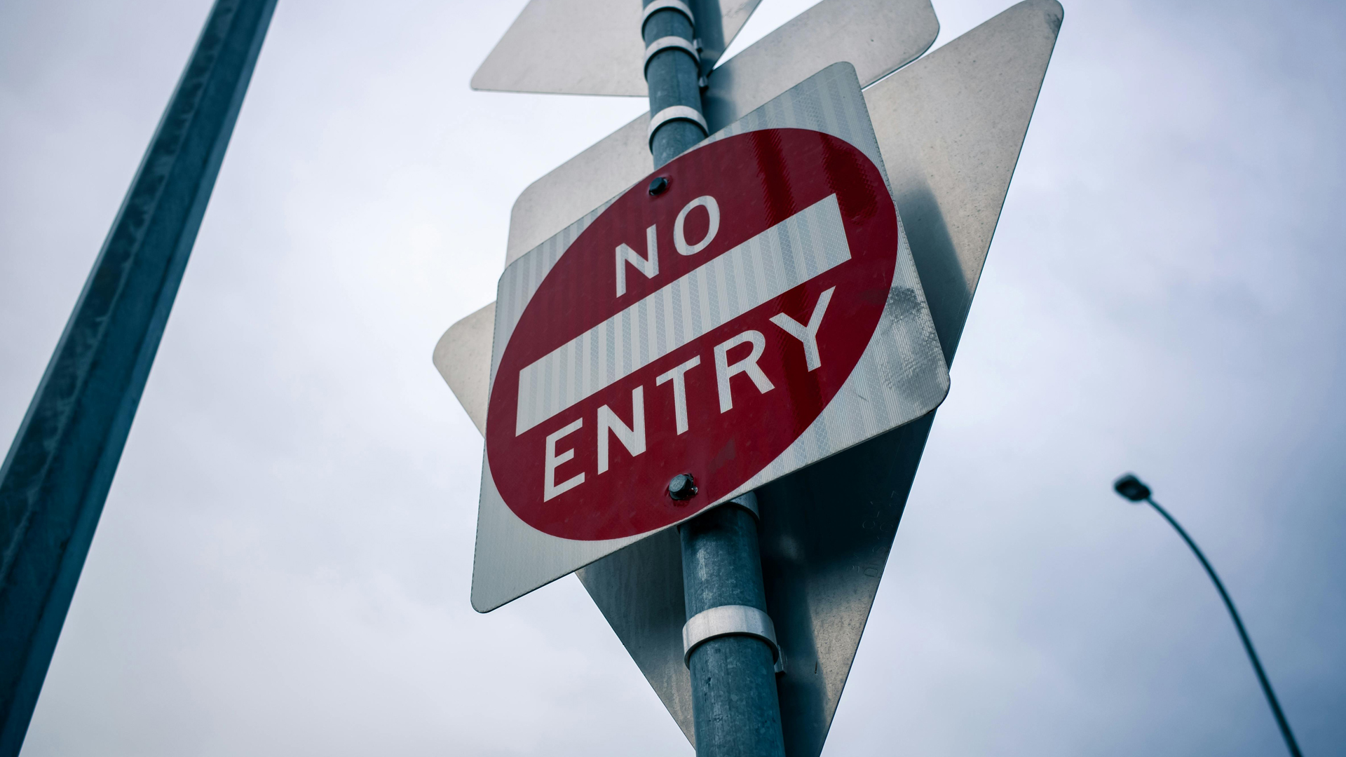
Road sign typography looks boring on purpose. At speed, clarity beats personality, and a moment of hesitation can cost more than you think.
Most people do not think about typography when they are driving. They think about the turn they might miss, the exit they need, the car in front. The letters on road signs are just there. That is exactly the point.
Road sign typography is one of the clearest examples of design doing its best work quietly. It is not trying to be stylish. It is not trying to be memorable. It is trying to be read at speed, from a distance, under stress, in imperfect light with as little mental effort as possible.
When you are driving, reading is not reading. It is recognition.
On your phone, you can pause. You can zoom. You can reread. On the road, you do not get that luxury. Your eyes flick to the sign, your brain grabs the meaning, and you move on. The whole transaction takes less than a second.
If a sign makes you hesitate even for a moment it is already costing you something.
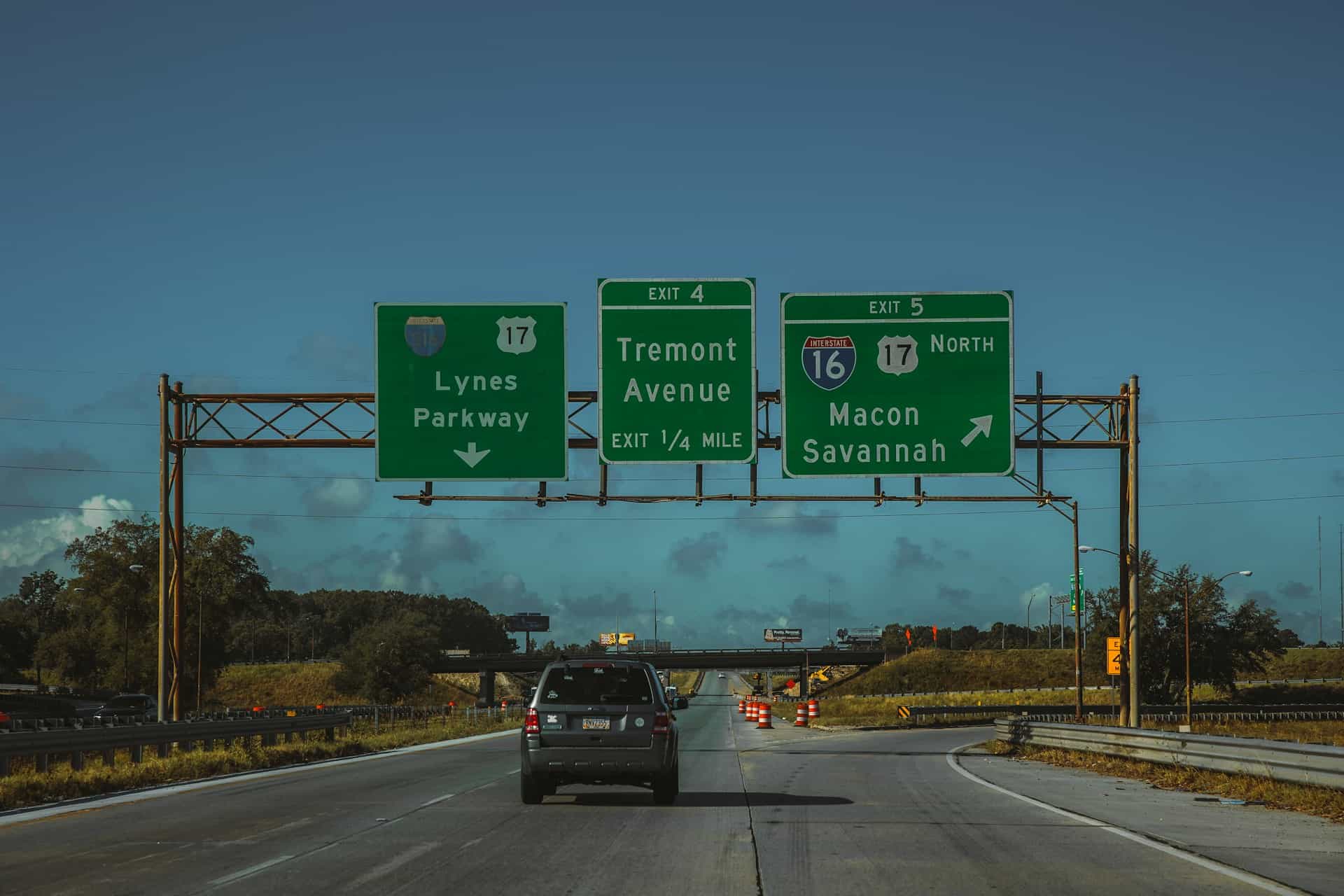
That is why road sign type looks the way it does. The shapes are built to stay legible when they are small, far, and moving. The spacing is doing as much work as the letters. The numbers have to be unmistakable. The words need to stand out without shouting.
It is less about beauty and more about preventing the half-second of confusion that sends someone the wrong way.
A road sign typeface is basically an anti-mistake machine.
It exists to reduce the moments where your brain goes wait, what did that say? That means avoiding letterforms that blur into each other. Staying legible when the sign is dirty, the lighting is harsh, or the windshield is doing you no favors.
And because this is public infrastructure, it also needs a consistency that goes beyond brand. Not visual coherence for its own sake — but the kind where your brain can trust what it sees fast, without second-guessing itself.
It does not need your admiration. It needs your trust. And it earns that trust the same way any good system does by never surprising you in the wrong moment.
Less hesitation. Fewer second glances. Less uncertainty in a situation that is already moving faster than you can think.
You do not compliment a road sign for good typography. You just arrive where you meant to go.