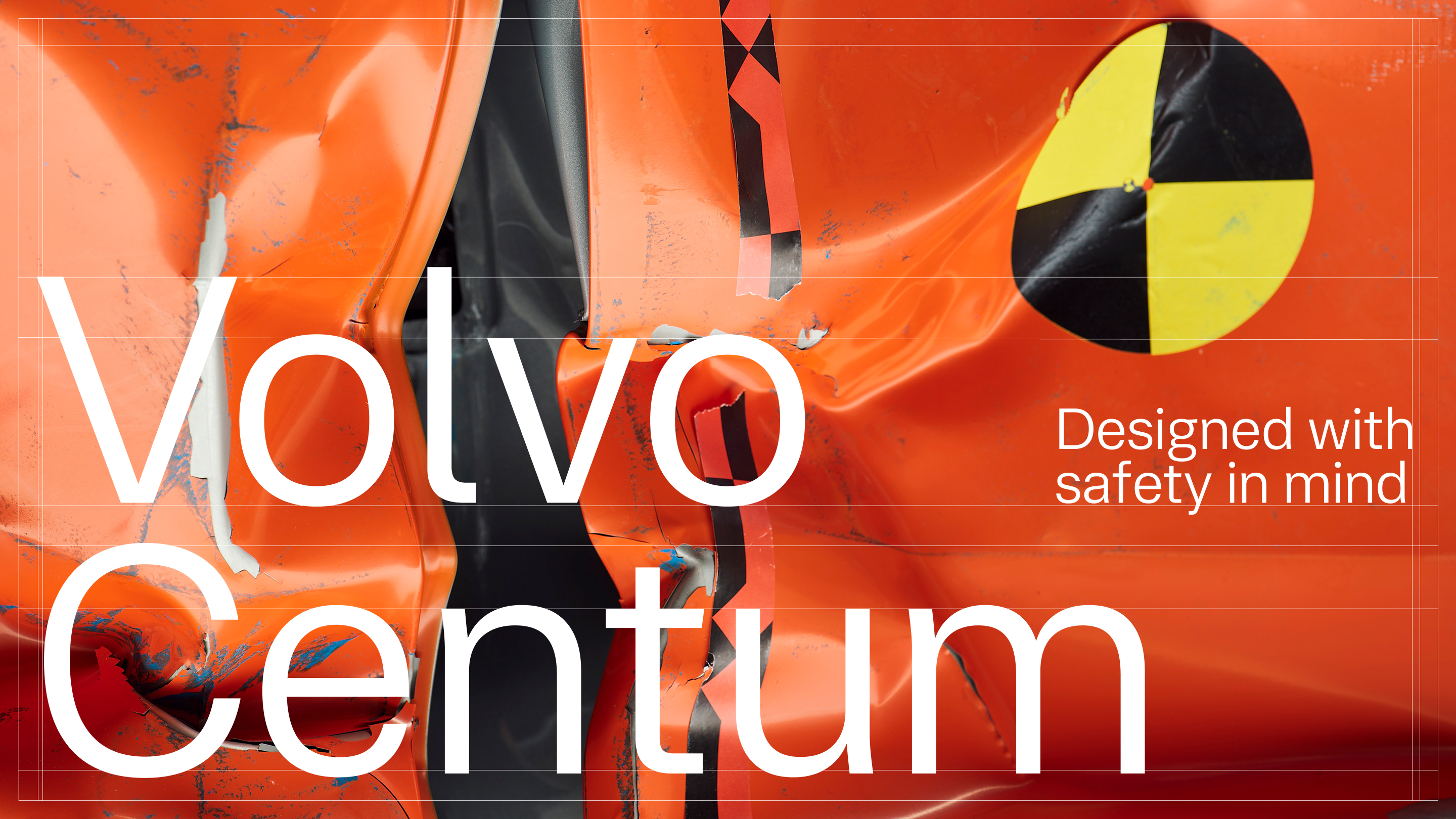
The Font You Would Never Compliment
Journal Description
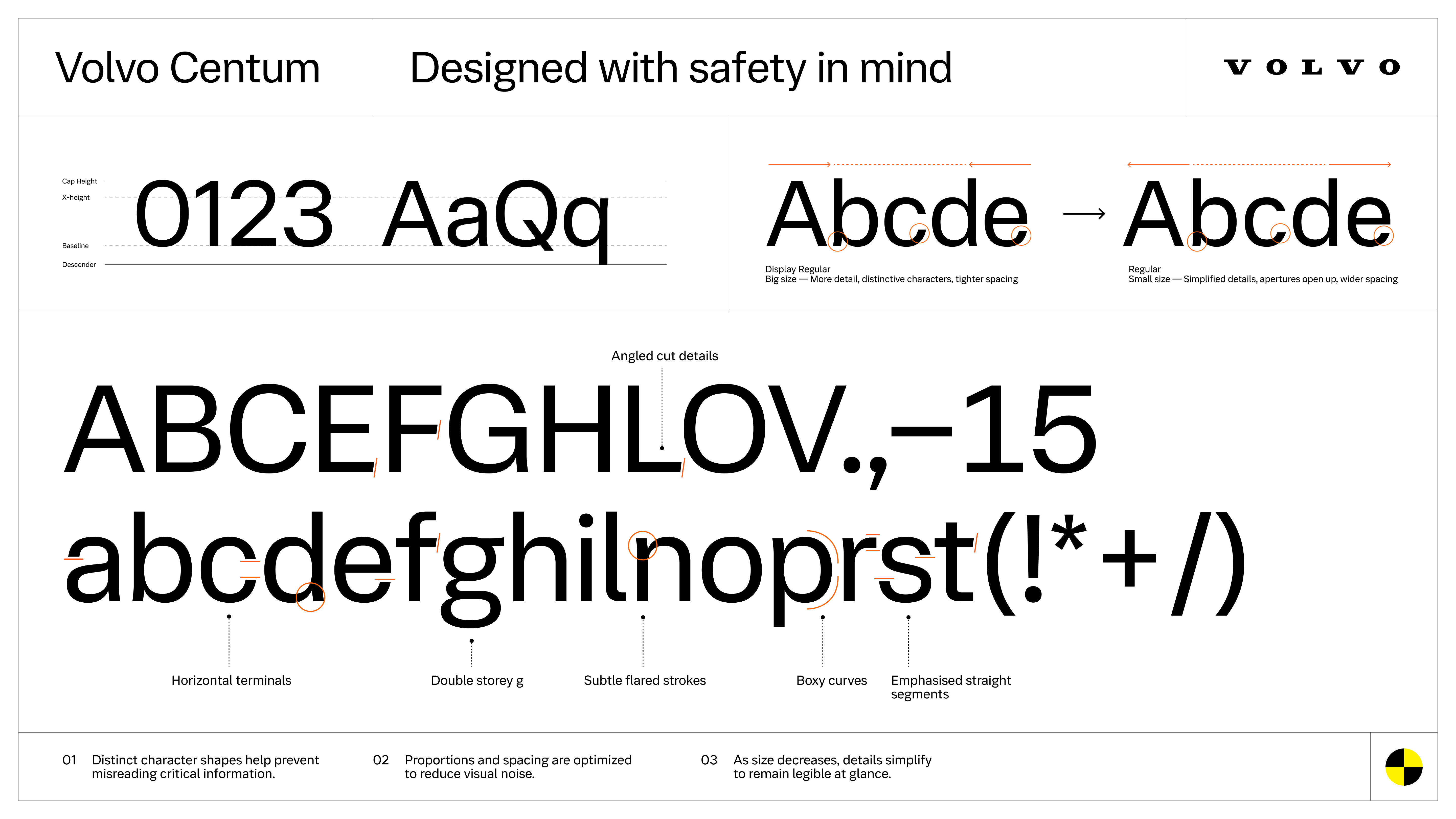
Volvo Centum is built for glance reading, where clarity is measured in seconds. You will never compliment this font. That is the point.
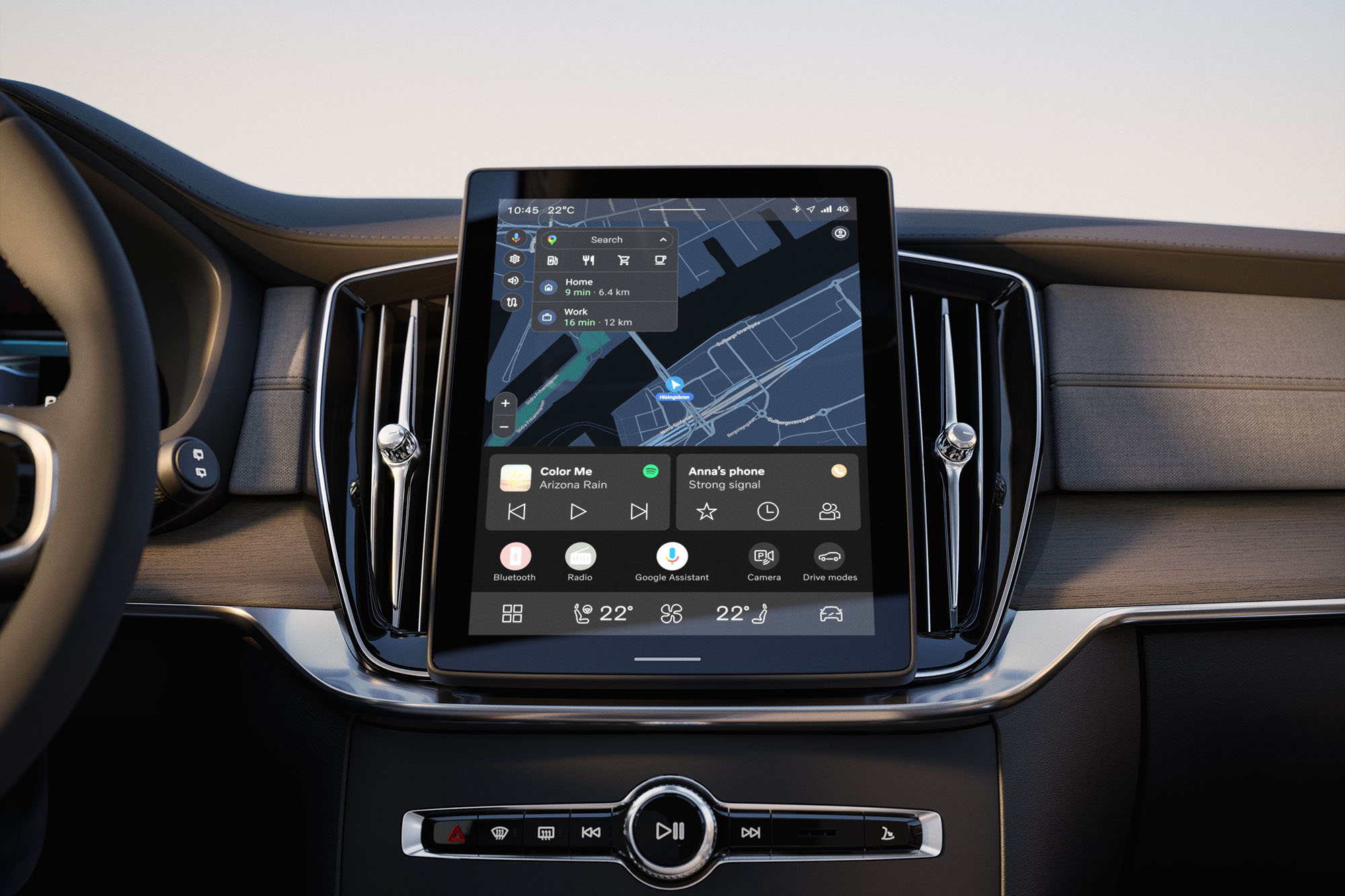
Most people do not notice typefaces in cars. They notice the screen, the map, maybe the colors. The letters are just there.
That is the point.
Volvo Centum is one of those design decisions that tries very hard to disappear. Not because it is unimportant, but because its job is not to be admired. Its job is to be read fast, with minimal effort, in the one context where effort costs something real.
A quick glance. A half second. Eyes back on the road.
Glance reading is different reading
Reading a book is calm. Your eyes settle, your brain fills gaps, and typography can afford to be expressive. Inside a car, reading is something else entirely. It is interrupted. It is rushed. It is closer to recognition than reading.
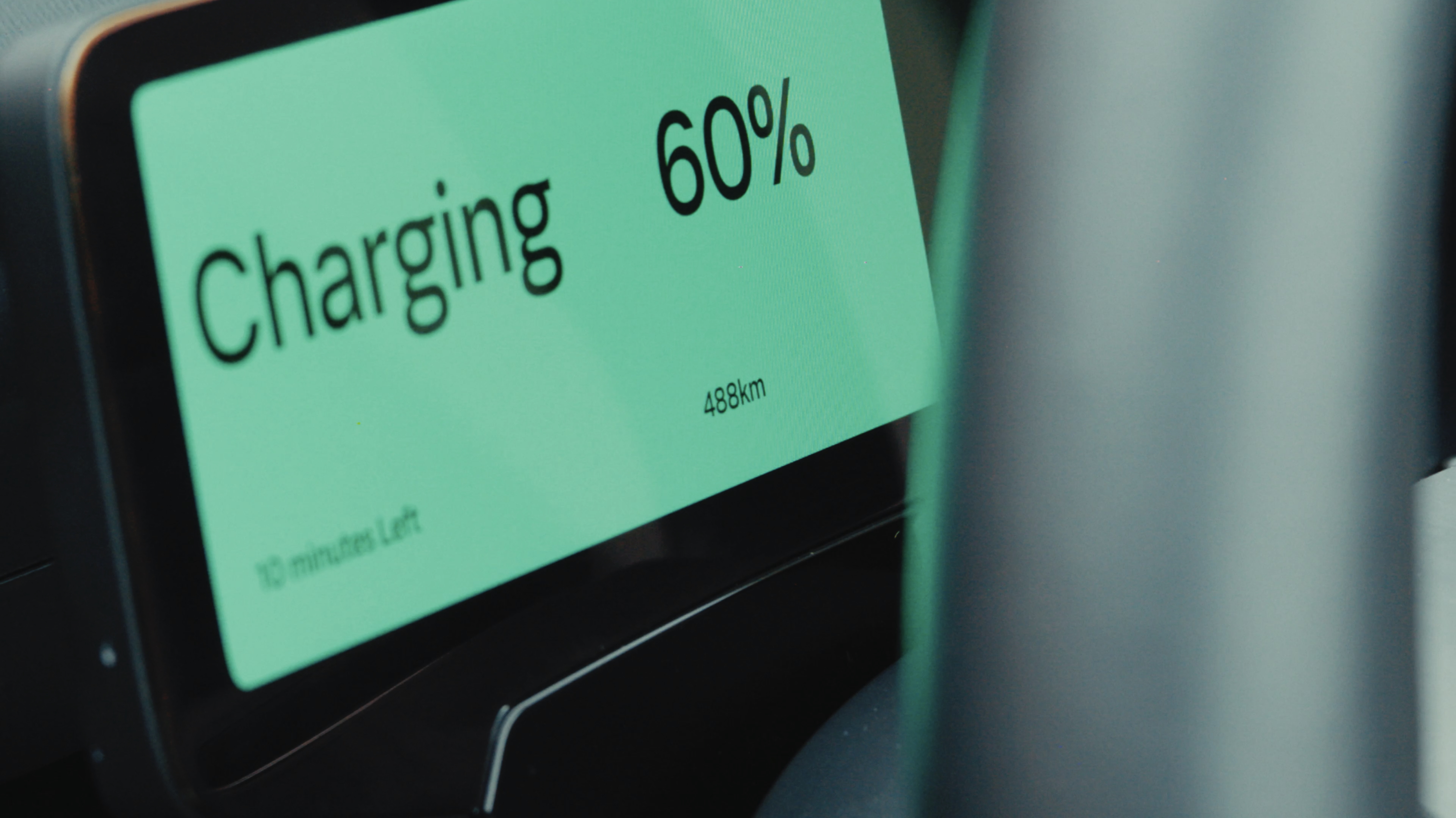
You are not decoding a paragraph. You are catching a word, a number, a warning then immediately looking away. That means the typeface is not just style. It becomes part of the interface. And the interface becomes part of safety.
The boring details are doing the real work
This is where the quiet function lives. Small choices that usually don’t matter start to matter a great deal.
Spacing that stays clear at small sizes. Shapes that don’t collapse on a backlit screen. Characters that don’t blur into each other when you’re tired, or stressed, or moving at 110 km/h.

When a system makes you double-check, it adds friction. When it adds doubt, it adds time. And time is the one thing you do not want to spend with your eyes off the road.
Typography stops being decoration and starts being infrastructure.
Why Volvo would care enough to make a whole typeface
Because the screen is not a “nice to have” anymore. Navigation, alerts, speed, controls, notifications they all live in the same place. Once that happens, every typographic decision carries more weight than it ever did on a printed page.
A readable system reduces hesitation. It reduces rechecking. It reduces the fraction of a second your eyes spend away from what actually matters.
Nobody will ever stop at a Volvo showroom and say, “I love the font.” Nobody will screenshot the dashboard and post it with a caption about kerning.
You will never compliment this font. You will just feel like the system is calm, clear, and trustworthy and you will never know exactly why.